CSS是一种用于描述HTML或XML(包括如SVG,MathML等衍生语言)文档样式的样式表语言,它不仅仅可以用于控制网页的布局和颜色,还能够对网页中元素位置的排版进行像素级精确控制,能够生成各种形状,不管在日常的开发还是学习中,对我们都有帮助。
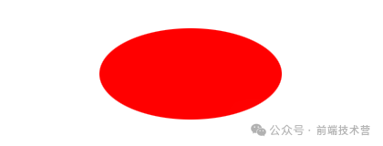
和圆形类似,如果元素的宽度和高度不同,那么border-radius: 50%就会创建一个椭圆形。
<div id="oval"></div>

#oval {
  width: 200px;
  height: 100px;
  background: red;
  border-radius: 100px / 50px;
}
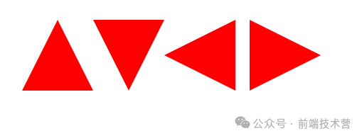
利用边框的特性,可以创建一个三角形,可以通过调整边框的大小和颜色来创建不同方向和颜色的三角形。
<div id="triangle-up"></div>

#triangle-up {
  width: 0;
  height: 0;
  border-left: 50px solid transparent;
  border-right: 50px solid transparent;
  border-bottom: 100px solid red;
}
<div id="triangle-down"></div>

#triangle-down {
  width: 0;
  height: 0;
  border-left: 50px solid transparent;
  border-right: 50px solid transparent;
  border-top: 100px solid red;
}
<div id="triangle-left"></div>

#triangle-left {
  width: 0;
  height: 0;
  border-top: 50px solid transparent;
  border-right: 100px solid red;
  border-bottom: 50px solid transparent;
}
<div id="triangle-right"></div>

#triangle-right {
  width: 0;
  height: 0;
  border-top: 50px solid transparent;
  border-left: 100px solid red;
  border-bottom: 50px solid transparent;
}
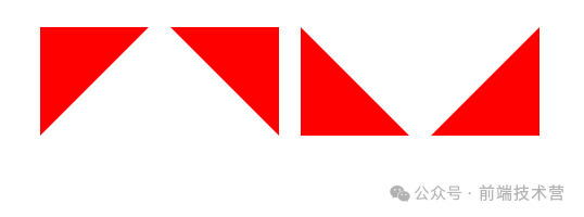
<div id="triangle-lefttop"></div>
<div id="triangle-righttop"></div>
<div id="triangle-leftbottom"></div>
<div id="triangle-rightbottom"></div>

/* 左上角 */
#triangle-lefttop {
  width: 0;
  height: 0;
  border-top: 100px solid red;
  border-right: 100px solid transparent;
}
/* 右上角 */
#triangle-righttop {
  width: 0;
  height: 0;
  border-top: 100px solid red;
  border-left: 100px solid transparent;
}
/* 左下角 */
#triangle-leftbottom {
  width: 0;
  height: 0;
  border-bottom: 100px solid red;
  border-right: 100px solid transparent;
}
/* 右下角 */
#triangle-rightbottom {
  width: 0;
  height: 0;
  border-bottom: 100px solid red;
  border-left: 100px solid transparent;
}
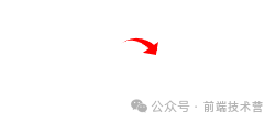
<div id="curvedarrow"></div>

#curvedarrow {
  position: relative;
  width: 0;
  height: 0;
  border-top: 9px solid transparent;
  border-right: 9px solid red;
  transform: rotate(10deg);
}
#curvedarrow:after {
  content: "";
  position: absolute;
  border: 0 solid transparent;
  border-top: 3px solid red;
  border-radius: 20px 0 0 0;
  top: -14px;
  left: -9px;
  width: 14px;
  height: 14px;
  transform: rotate(45deg);
}
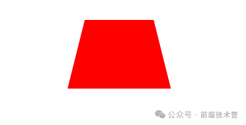
<div id="trapezoid"></div>

#trapezoid {
  border-bottom: 100px solid red;
  border-left: 25px solid transparent;
  border-right: 25px solid transparent;
  height: 0;
  width: 100px;
}
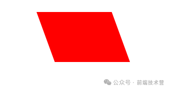
<div id="parallelogram"></div>

#parallelogram {
  width: 150px;
  height: 100px;
  transform: skew(20deg);
  background: red;
}
<div id="star-five"></div>

#star-five {
  margin: 100px 0;
  position: relative;
  display: block;
  color: red;
  width: 0px;
  height: 0px;
  border-right: 100px solid transparent;
  border-bottom: 70px solid red;
  border-left: 100px solid transparent;
  transform: rotate(35deg);
}
#star-five:before {
  border-bottom: 80px solid red;
  border-left: 30px solid transparent;
  border-right: 30px solid transparent;
  position: absolute;
  height: 0;
  width: 0;
  top: -45px;
  left: -65px;
  display: block;
  content: '';
  transform: rotate(-35deg);
}
#star-five:after {
  position: absolute;
  display: block;
  color: red;
  content: '';
  top: 3px;
  left: -105px;
  width: 0px;
  height: 0px;
  border-right: 100px solid transparent;
  border-bottom: 70px solid red;
  border-left: 100px solid transparent;
  transform: rotate(-70deg);
}

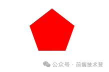
<div id="pentagon"></div>

#pentagon {
  position: relative;
  width: 54px;
  box-sizing: content-box;
  border-width: 50px 18px 0;
  border-style: solid;
  border-color: red transparent;
}
#pentagon:before {
  content: "";
  position: absolute;
  height: 0;
  width: 0;
  top: -85px;
  left: -18px;
  border-width: 0 45px 35px;
  border-style: solid;
  border-color: transparent transparent red;
}
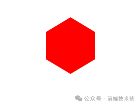
<div id="hexagon"></div>

#hexagon {
  width: 100px;
  height: 55px;
  background: red;
  position: relative;
}
#hexagon:before {
  content: "";
  position: absolute;
  top: -30px;
  left: 0;
  width: 0;
  height: 0;
  border-left: 50px solid transparent;
  border-right: 50px solid transparent;
  border-bottom: 30px solid red;
}
#hexagon:after {
  content: "";
  position: absolute;
  bottom: -30px;
  left: 0;
  width: 0;
  height: 0;
  border-left: 50px solid transparent;
  border-right: 50px solid transparent;
  border-top: 30px solid red;
}
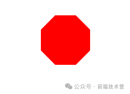
<div id="octagon"></div>

#octagon {
    width: 100px;
    height: 100px;
    background: red;
    position: relative;
}

#octagon:before {
    content: "";
    position: absolute;
    top: 0;
    left: 0;
    border-bottom: 29px solid red;
    border-left: 29px solid #fff;
    border-right: 29px solid #fff;
    width: 42px;
    height: 0;
}

#octagon:after {
    content: "";
    position: absolute;
    bottom: 0;
    left: 0;
    border-top: 29px solid red;
    border-left: 29px solid #fff;
    border-right: 29px solid #fff;
    width: 42px;
    height: 0;
}
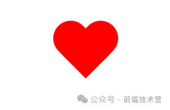
<div id="heart"></div>

#heart {
  position: relative;
  width: 100px;
  height: 90px;
}
#heart:before,
#heart:after {
  position: absolute;
  content: "";
  left: 50px;
  top: 0;
  width: 50px;
  height: 80px;
  background: red;
  border-radius: 50px 50px 0 0;
  transform: rotate(-45deg);
  transform-origin: 0 100%;
}
#heart:after {
  left: 0;
  transform: rotate(45deg);
  transform-origin: 100% 100%;
}
前端技术营欢迎来到前端技术营!专注分享前端技术干货,推送前端实用文章,追求代码中的精致与典雅,解读前端的意趣与智慧。每天学习一点点,每天进步一点点,与读者共同进步,一起成长。
37篇原创内容
公众号
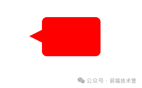
<div id="talkbubble"></div>

#talkbubble {
  width: 120px;
  height: 80px;
  background: red;
  position: relative;
  -moz-border-radius: 10px;
  -webkit-border-radius: 10px;
  border-radius: 10px;
}
#talkbubble:before {
  content: "";
  position: absolute;
  right: 100%;
  top: 26px;
  width: 0;
  height: 0;
  border-top: 13px solid transparent;
  border-right: 26px solid red;
  border-bottom: 13px solid transparent;
}
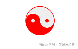
<div id="taiji"></div>

#taiji {
  width: 96px;
  box-sizing: content-box;
  height: 48px;
  background: #eee;
  border-color: red;
  border-style: solid;
  border-width: 2px 2px 50px 2px;
  border-radius: 100%;
  position: relative;
}
#taiji:before {
  content: "";
  position: absolute;
  top: 50%;
  left: 0;
  background: #eee;
  border: 18px solid red;
  border-radius: 100%;
  width: 14px;
  height: 14px;
  box-sizing: content-box;
}
#taiji:after {
  content: "";
  position: absolute;
  top: 50%;
  left: 50%;
  background: red;
  border: 18px solid #eee;
  border-radius: 100%;
  width: 14px;
  height: 14px;
  box-sizing: content-box;
}
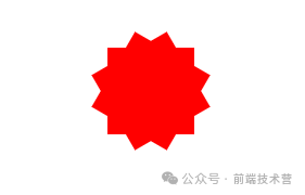
<div id="flower-12"></div>

#flower-12 {
  background: red;
  width: 80px;
  height: 80px;
  position: relative;
  text-align: center;
}
#flower-12:before,
#flower-12:after {
  content: "";
  position: absolute;
  top: 0;
  left: 0;
  height: 80px;
  width: 80px;
  background: red;
}
#flower-12:before {
  transform: rotate(30deg);
}
#flower-12:after {
  transform: rotate(60deg);
}
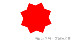
<div id="flower-8"></div>

#flower-8 {
  background: red;
  width: 80px;
  height: 80px;
  position: relative;
  text-align: center;
  transform: rotate(20deg);
}
#flower-8:before {
  content: "";
  position: absolute;
  top: 0;
  left: 0;
  height: 80px;
  width: 80px;
  background: red;
  transform: rotate(135deg);
}
<div id="badge-ribbon"></div>

#badge-ribbon {
  position: relative;
  background: red;
  height: 100px;
  width: 100px;
  border-radius: 50px;
}
#badge-ribbon:before,
#badge-ribbon:after {
  content: '';
  position: absolute;
  border-bottom: 70px solid red;
  border-left: 40px solid transparent;
  border-right: 40px solid transparent;
  top: 70px;
  left: -10px;
  transform: rotate(-140deg);
}
#badge-ribbon:after {
  left: auto;
  right: -10px;
  transform: rotate(140deg);
}

<div id="lock"></div>

#lock {
  font-size: 8px;
  position: relative;
  width: 180px;
  height: 130px;
  border-radius: 20px;
  top: 100px;
  box-sizing: border-box;
  border: 35px solid red;
  border-right-width: 75px;
  border-left-width: 75px;
  margin: 0 0 60px 0;
}
#lock:before {
  content: "";
  box-sizing: border-box;
  position: absolute;
  border: 25px solid red;
  width: 140px;
  height: 120px;
  left: 50%;
  margin-left: -70px;
  top: -120px;
  border-top-left-radius: 70px;
  border-top-right-radius: 70px;
}
#lock:after {
  content: "";
  box-sizing: border-box;
  position: absolute;
  border: 10px solid red;
  width: 50px;
  height: 80px;
  border-radius: 25px;
  left: 50%;
  top: -10px;
  margin-left: -25px;
}

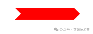
<div id="pointer"></div>

#pointer {
  width: 200px;
  height: 40px;
  position: relative;
  background: red;
}
#pointer:after {
  content: "";
  position: absolute;
  left: 0;
  bottom: 0;
  width: 0;
  height: 0;
  border-left: 20px solid white;
  border-top: 20px solid transparent;
  border-bottom: 20px solid transparent;
}
#pointer:before {
  content: "";
  position: absolute;
  right: -20px;
  bottom: 0;
  width: 0;
  height: 0;
  border-left: 20px solid red;
  border-top: 20px solid transparent;
  border-bottom: 20px solid transparent;
}
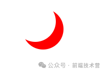
<div id="moon"></div>

#moon {
  width: 80px;
  height: 80px;
  border-radius: 50%;
  box-shadow: 15px 15px 0 0 red;
}
该文章在 2024/3/29 23:31:23 编辑过


 400 186 1886